Thursday, June 22, 2006

Middle Major

Ah the Middle Major Key is a joy to weave.

It is clear to me why it is the most used value key. It is so easy to use. The color selection is not difficult and the colors remain true. And you get a wonderful sense of satisfaction as everything seems to come together effortlessly. Things done in this key just seem to look "right".

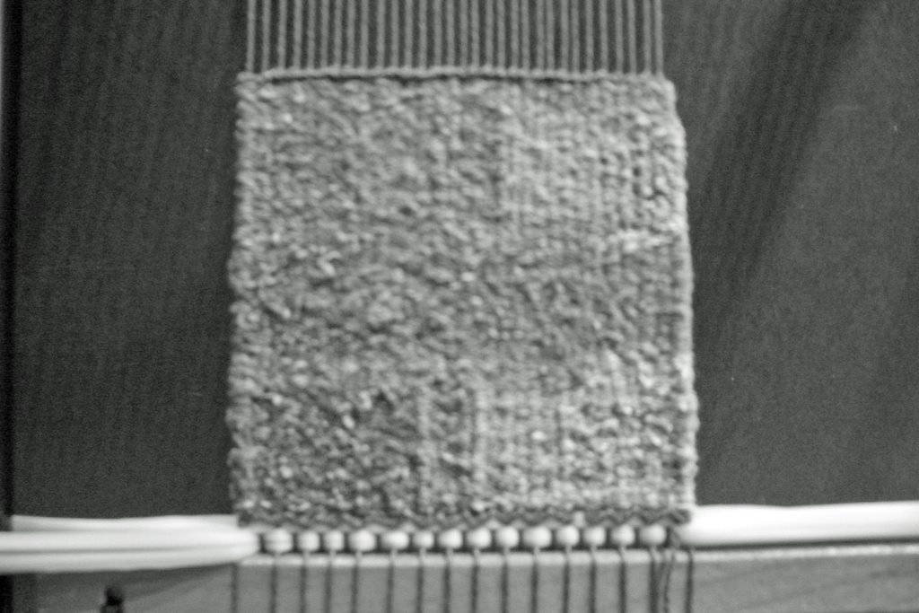
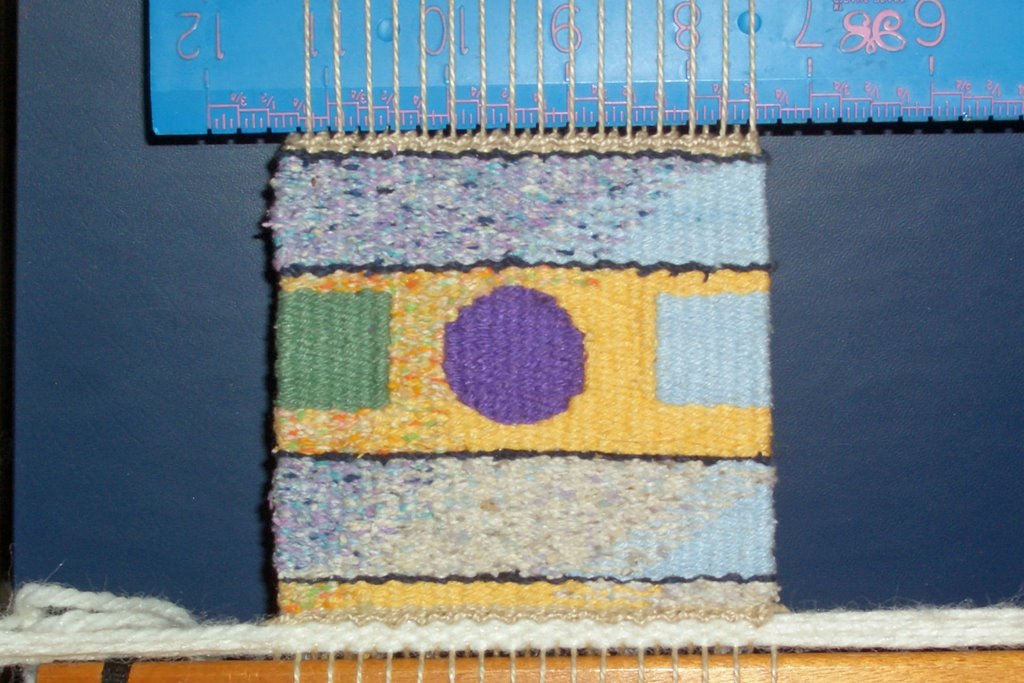
In the Middle Major Key the middle value colors dominate and they are combined with very light and very dark accents. Although I don't really care that much for the colors in my middle value palette of yarns, this was simply a joy to weave. The addition of the very light and very dark make for a good design and adds the needed dimension to the middle value colors.

It evokes strength, boldness, stability and balance. Clearly this is a key to use for the 'middle of the bell' curve pieces. It should yield good satisfying pieces that evoke a solid and balanced impression for the viewer. It would also be a good palette to select when in a workshop and trying to learn some new technique. By using this palette you wouldn't be distracted by problem colors.

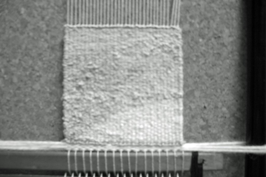
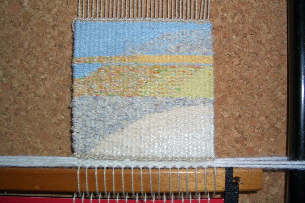
I liked this key so much, I did another with the same cartoon but in a different hue. This little tapestry wove up in less than two hours....And it was quite a satisfying two hours.

The end result is fabulous...and quite interesting...so similar to the first one but yet so different. It too, looks 'right' - well balanced, stable and implying strength. This a perfect key for many pieces.

But it is clear to me, moving to other keys - particularly the minor keys can evoke a strong yet subtle emotion from a piece and make viewers study it longer to figure out what is not quite right...

Tuesday, June 20, 2006

An Extended Middle Minor

I started and finished a small tapestry in what is called an Extended Middle Minor Key.

This value key uses the mid-values and its neighbors on each side; the low light values and high dark values. So there are more color choices and a bit more contrast.

You can see that the Extended Middle Minor provides more contrast by viewing in grayscale the Middle Minor - I finished just recently.

In color, you can see it lacks the peacefulness and serenity of the Middle Minor but it doesn't really have enough contrast to be dramatic. It still evokes a sense of calmness when I look at it. It also seems a bit surrealist as predicted.

I like this color combination and would like to do something larger in these blues, purples, greens and a splotch of poppy orange.


ps I didn't realize how blurry the Middle Minor photos were...I am going to take some better ones...

Sunday, June 18, 2006

Middle Minor

There were only four of us at the last Tapestry Group meeting...lots of people traveling for the summer.

I continued my value study at the meeting by selecting the yarns for my piece in Middle Minor. The "Middle" implies mid-values and the "Minor" means there are only mid-values in the piece. From the black and white photo you can easily see the colors chosen are all the same value and darker than the High Minor I wove previously. There are some slightly lighter values on the right side...those are there to tie in with the 4 by 4 square [a high major] that will be directly to the right.

I just finished this piece this morning. I discovered when taking photos the flash makes the values and colors look much different than when I simply look at them. So I took photos without the flash...its foggy this morning so these photos are not the best.

In Minor keys there are no 'accent' colors since all the colors are from the same value. This creates a dreamlike, serene and peaceful feel. I definately get those feelings in this piece. This was a similar feel from the High Minor.

If one uses cool and unsaturated colors one is supposed to get a feeling of distance, if bright colors are used it should be exciting. I have very few bright colors in my pallette...but cool and unsaturated colors I do have. In this piece the green in the left corner does seem to be much closer than the other cool colors which seem to be a bit further away.

I like the minor keys. The calm and peaceful feelling is an interesting effect - I like the feeling that is generated when I am weaving. On the intellectual side, it is quite challenging to come up with an interesting composition with colors in all the same key.

Next...an extended middle minor...

Tuesday, June 06, 2006

Preparing for the Mid-Values

My baby Shannock was warped at the last tapestry meeting and is awaiting discoveries in the middle values.

I am using a medium gray warp; 3/2 pearl cotton with space for four weavings and lots of warp left over on the top and bottom so I can braid the edges.

There are three on queue...

1. Middle Minor uses only the middle values. Since there are no accents the overall impact should be serene, perhaps quiet and stable. With bright colors it can be exciting. With unsaturated colors - a feeling of distance. This will be a bit tough, since I really don't care too much for my mid-value colors...

2. Middle Major uses most of the middle values plus some very light and very dark as accents. I [we] should see strength, boldness, stability and balance. According to Color Works, the middle key looks different in different mediums. I look forward to seeing how it looks in a little tapestry using my cotton/silk blend of yarn and comparing the results with the photos in the book.

3. Extended Middle Minor will include the neighbor of middle minor on each side for its color palette. The neighbors of mid-value are some really fun colors. I look forward to working on this one. This key has a little more contrast than the middle minor but less than the middle major. It is supposed to be surrealistic.

Hmmm...this sounds like fun. Too bad I am busily working on a taquete scarf and a large tapestry of Saturn right now. This will have to wait until the next group Tapestry Day.