Tuesday, May 30, 2006

The High Values - Retrospective
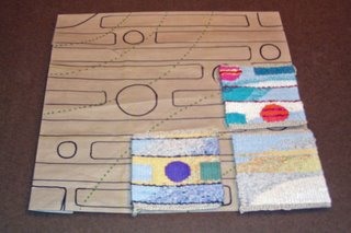
I have finished my first tour of the high value yarns in my study of value. High values are the light values. It is easy to remember which is which if you think of music - - if you play the real high notes they sound light in comparison to the real low notes which sound somber and dark.

These are the keys that the Impressionists such as Claude Monet, Edgar Degas, Alfred Sisley and Camille Pissarro used. Their paintings captured the outside and the feeling you get when you are outside with the sun shining on your face or the mist along your cheek.

I can see a lot of uses for this key. In landscapes it is the snow on a sunny day, an ocean sparkling from a setting sun or the sun breaking through the fog or haze. Using it for a still life of delicate objects, perhaps a vase of wildflowers, I could create a soft and romantic mood with pale values and soft diffused light coming from a nearby window. In a portrait, it would be quite useful to portray youth, innocence, gentleness and grace.

HIGH MINOR

Colors: only high value colors
Emotions: peacefulness, delicacy, fragility, tenderness, softness, purity
Variations:
I) use unsaturated colors - - more whisper like
ii) use very dull colors - - more subtle
iii) use clear bright colors - - more lighthearted

The high minor uses all high value colors so there is no big contrast and from a distance it appears less interesting than other keys. The subtle contrasts are only visible up close. It appears airy and light - - like a whisper. Viewed in color, the small subtleties of contrast show up...in grayscale it almost disappears.

HIGH MAJOR
Colors: predominately high value with some mid value and very dark accent
Emotions: positive energy
Variations: use lots of bright colors - - for a happy, boisterous feeling

The High Major extends the high minor palette to include colors from the entire range but maintains the dominance of the light values. A very dark is used for accent only. All major keys evokes boldness, strength and assertiveness.
Sunday, May 28, 2006

Another Happy High Major

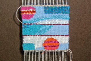
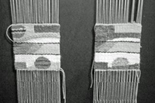
I finished the second high major tapestry using 'bright' colors. Here it is on the left.

It's the same basic design as the previous one but I took out the green and added pink. I think this goes better with the first two and is a better example of a high major. I think the other one I did had too much of the darker mid-values in it. The whole idea of the high major is to have predominately all high values with a few mid-values plus an accent of a very dark value. The green was at the darker end of the mid-value yarns while the pink was at the lighter end. In this latest one I used a dark maroon as the accent instead of the navy blue.

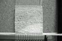
To see my point about having more high values in the latter one...check out this black and white photo.

Wednesday, May 24, 2006

A Happy High Major

I started the 'happy' high major at the last tapestry meeting. Just finished it today. This is a high major using bright colors. In my yarn selection, I don't have what I would call real bright colors...most are muted a bit. I selected the brightest ones I had to do this piece. The result is supposed to evoke a happy and boisterous mood.


I warped my baby shannock with the light warp in such a way that I could weave four small tapestries. Three done and one free space to weave. Since I am not quite satisfied with the color selection of the 'happy' high major I am going to do another with slightly different colors.

Friday, May 05, 2006

High Minor

Our tapestry group met today and I started the actual weaving of another little tapestry - this time it is in the value key of High Minor. That means it uses only those colors with light values. It will be the tapestry that is in the lower right hand corner of the final composition.

I spent some time last week re-evaluating my yarn selection for this project. I decided I lacked purples and whites as well as some reds. So I added these. I also re-evaluated the value categories since I found it quite confusing to use numbers or percentages to refer to different value categories. I switched from an 11 step scale to a 9 step scale which was developed by Denman Ross in 1907. Hey - why re-invent the wheel?

He used the following terms to describe the different value categories - -

White
High light
Light
Low light
Mid-value
High dark
Dark
Low dark
Black

This is way easier and way more useful. You can actually talk to others using these terms and not have to really define them very much.

So for my High Minor tapestry I only used yarn from the white, high light and light categories. This would limit the actual difference between value to two steps.

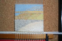
The High Minor is supposed to evoke something peaceful, subtle, delicate and/or fragile. Here are the pictures of the piece in High Minor that I finished this afternoon. Seem peaceful to you? I do like how the only real contrast is between the White yarns and the High Light yarns - not too much between the Light and High Light.

I do like the contrast between the White and the High Light yarns in the lower right corner. That is what I call a two step value contrast. The one step contrasts are far more subtle. And that is good. This tells me for at least these yarns I have the three lightest categories I have separated them into fairly good value categories.

Part of my value study is to develop the actual scale for the yarns I use in my tapestries. For more information - click here.