Another Happy High Major
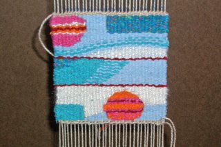
 I finished the second high major tapestry using 'bright' colors. Here it is on the left.
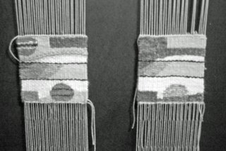
It's the same basic design as the previous one but I took out the green and added pink. I think this goes better with the first two and is a better example of a high major. I think the other one I did had too much of the darker mid-values in it. The whole idea of the high major is to have predominately all high values with a few mid-values plus an accent of a very dark value. The green was at the darker end of the mid-value yarns while the pink was at the lighter end. In this latest one I used a dark maroon as the accent instead of the navy blue.
To see my point about having more high values in the latter one...check out this black and white photo.


0 Comments:
Post a Comment
<< Home