Observations on Low Minor
For those of you not at yesterday's tapestry meeting, I am embarking upon a study of value with my 4 by 4 inch square tapestries. I spent a few minutes describing what I am going to do. Here is a synopsis for those who did not make the meeting. I look forward to hearing what you are going to do with your squares.
I am using Deb Menz's book called Color Works. It has a nice section of value where it defines different 'keys' of value...low minor, high major, etc. I am going to do a tapestry in each one and explore and play with the value concept as I go.
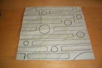
I have developed one cartoon for the entire piece [see photo]
 and divided it into nine sections. In this way, it will not be the design that impacts the viewer's perception of the piece it will be the color selection. Value has a key impact on the emotions felt when viewing a tapestry. For example, the low minor key evokes a somber, imposing and potentially sinister feeling.
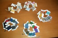
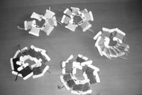
I took all my yarns and ordered them by value from darkest to lightest. I wanted a way to easily figure out the value of a specific yarn without re-checking over and over again. I put a small piece of each yarn I might use on small cardboard bobbins. I then ordered them by eleven different values as illustrated in Color Works and kept them organized on key rings. I would have used eleven key rings but I only have five. I use the black and white setting on my digital camera to help me order the yarns in value order. The two photos below show the yarns in color and in grey scale.

 At the tapestry meeting, I worked out which key I would use for each of the nine sections of the cartoon. And started to worry about how I wanted the ends to be finished...hems or braids. I am opting for braids.
With braiding a little bit of the warp braid will stick out so it matters which color - value is used. I don't want the braid to overshadow the tapestry. The darker ones will use black warp so as not to stand out too much. The middle range will use a medium brown warp and the lighter pieces will use a light grey.
I started this morning on my first square - -
Observations on weaving a square and concentrating about value:
1. A four inch square can be easily woven in less than a day. I completed one prior to 1:30 today...and I admit to a great amount of ripping and re-weaving.
2. A square is difficult - but achievable. One must check each row to ensure the edges are straight and that the piece is actually running at 4 inches.
3. Beating with the Shannock beater continues to compress the yarn even after a half inch of woven material. This is going to make it difficult to keep my bricks in the pattern lined up.
4. Well we all know value is different in different lights. Note also, the value of the yarn on those small swatches like my sample cards can be different than the value of the same yarn in a ball. And most interestingly, the value of the same yarn woven into the tapestry can also be different. Learning: if one is doing a study in value where the yarn is supposed to be a specific value...check and check and re-check the values. Keep that digital camera real close. Fortunately, the color selections are in ranges of values not specific ones.
5. The low minor key is the key that only uses the darker 35% of the grey scale. Surprisingly, that provided a big choice of yarns for me in a wide range of colors. I tended toward the darker end since I still wasn't positive some of the brighter yarns were actually in the darker 35%.
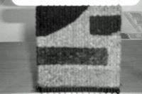
6. Does the piece appear somber? I must admit the photo makes it less somber looking. Color Works says the reason it looks somber is the lack of contrast - all the colors are in the same key. In my tapestry there does seem to be contrast. Hmm...


Next up is the Low Major key. It should help with the contrast issue...

3 Comments:
Yes, somber, but also pleasantly calm. That probably does have to do with choice of color and design. It will be interesting to see how your pieces look in relation to one another - and what the overall mood of the whole, large piece will be. I'm looking forward to learning a lot from your work.
You're trying to shame me into weaving instead of reading, aren't you?
the design creates a nice calm feeling...the color choice is more contrasting than somber, especially in the digital photo, than I would suspect...shall be interested to see all 9 when done and how the rest of the colorways play out...
very interesting - amazing lady - I too look forward to learning from the whole piece. I suspect you will have it done before I take my next breath.
However - I will have you know that I have gotten 5 rows knotted on my cut-pile bag which is pretty good for me.
Post a Comment
<< Home